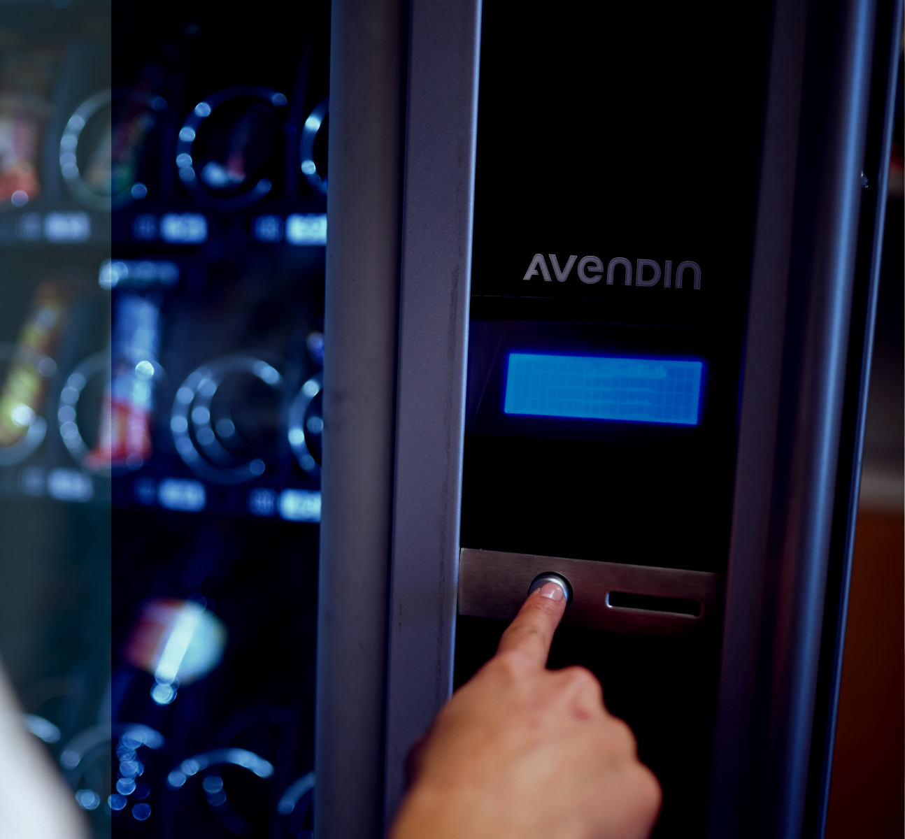
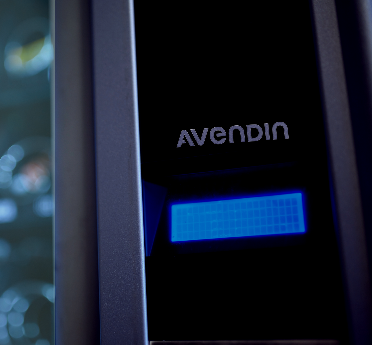
Avendin is a small size vending machine provider in Panama. My task was to design a clean, modern visual identity that reflects innovation, friendliness, and strength.
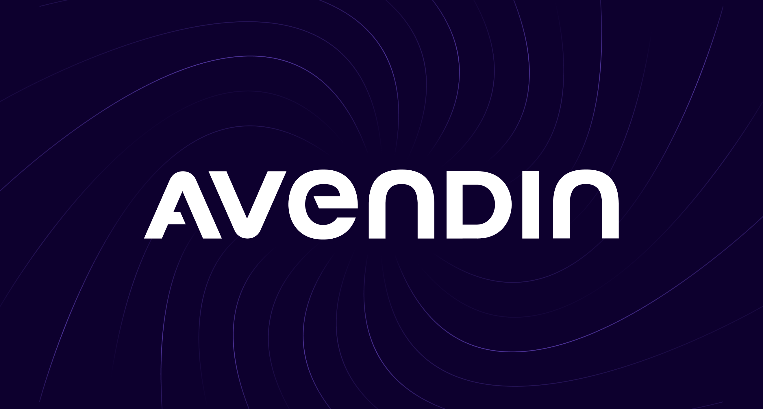
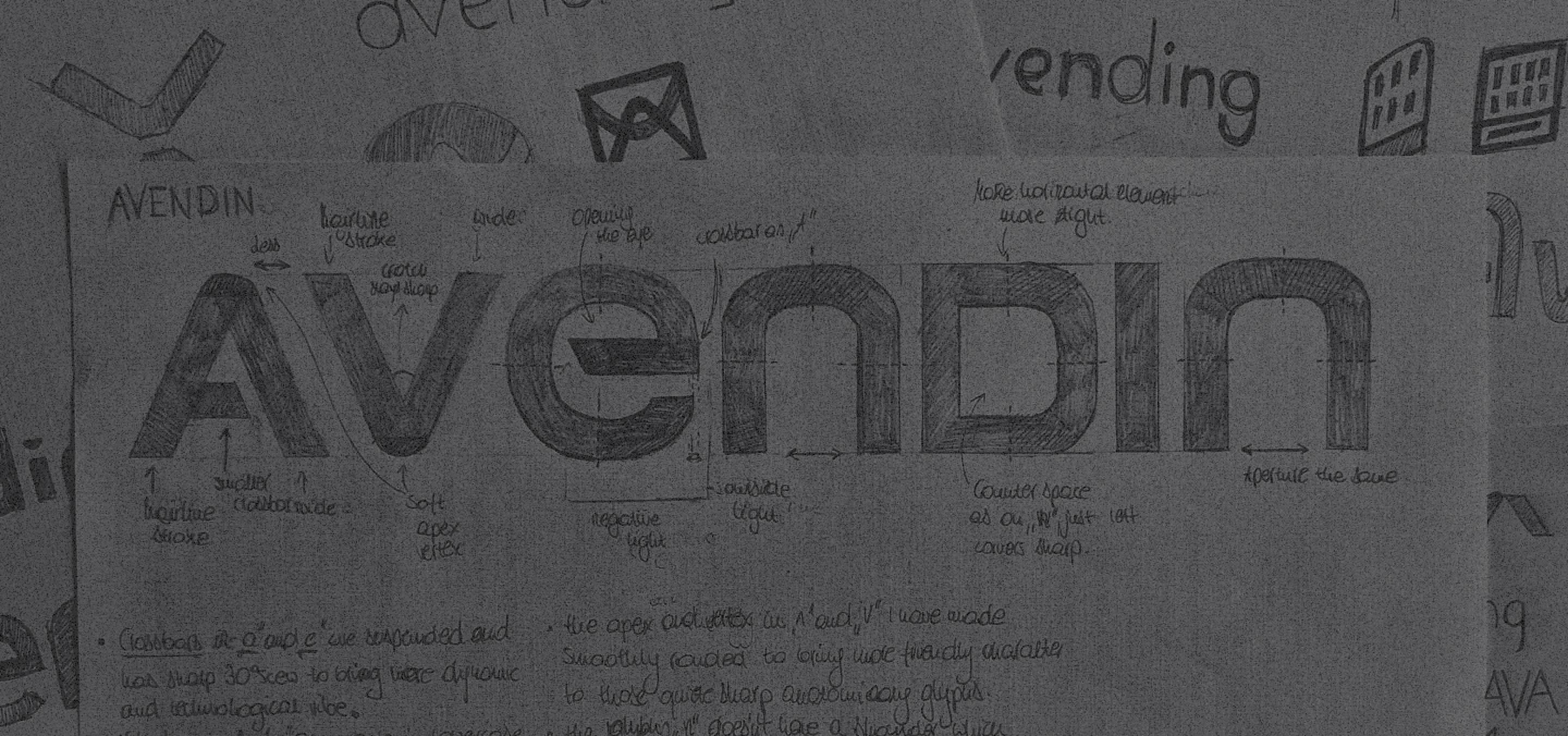
The logotype's foundation is the custom capital "A". Its bold strokes ensure stability, and the 65° angled crossbar creates a unique, forward-thinking mark.
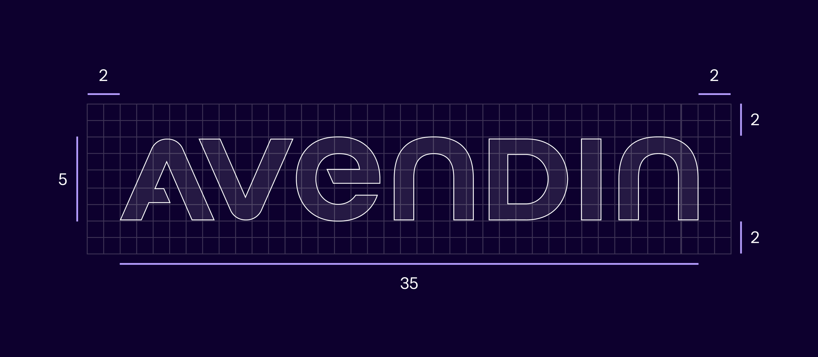
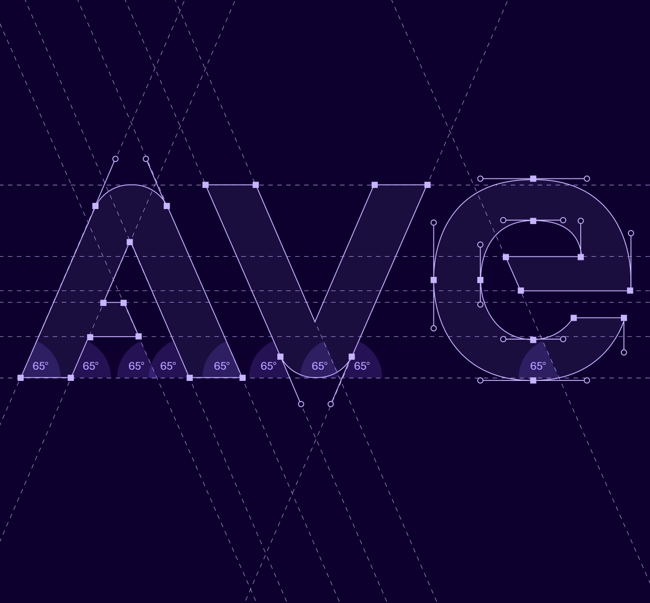
The 65° angle connects the entire logotype. The "V" mirrors the structure, and the custom, soft shapes of the lowercase "e" and "n" inject a crucial human touch.
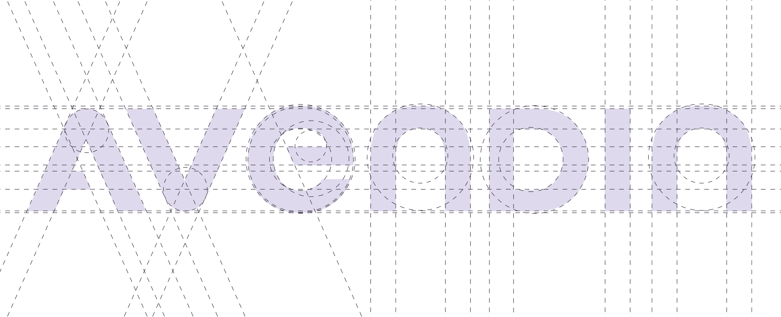
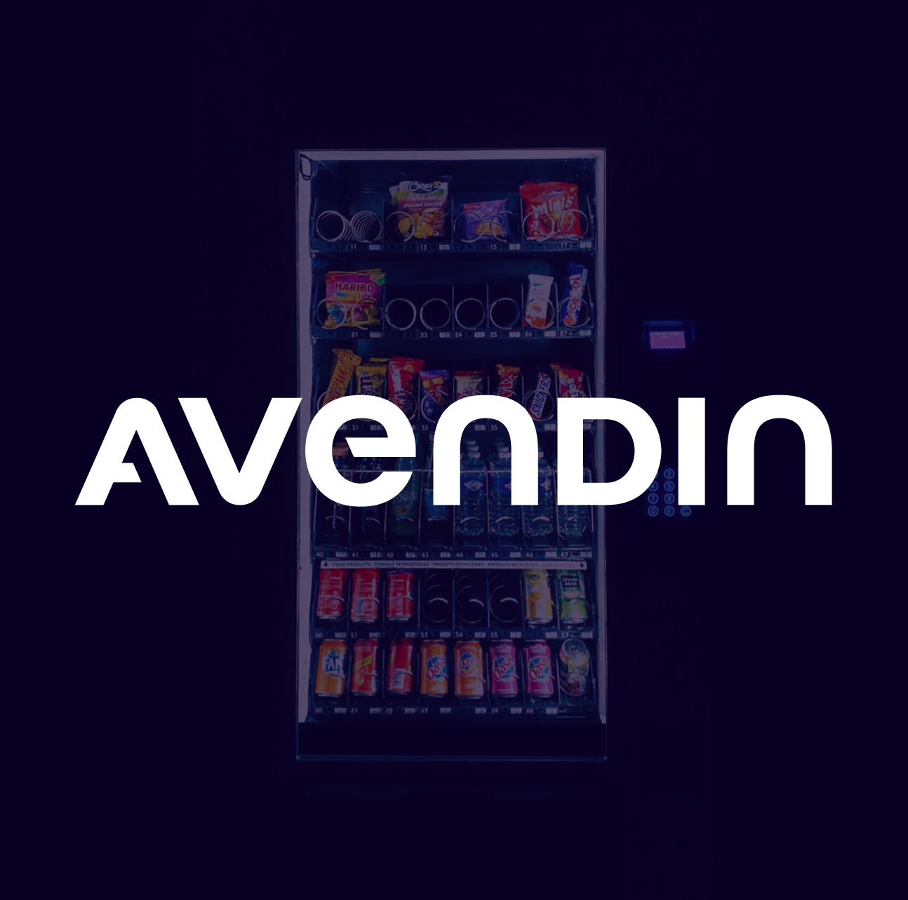
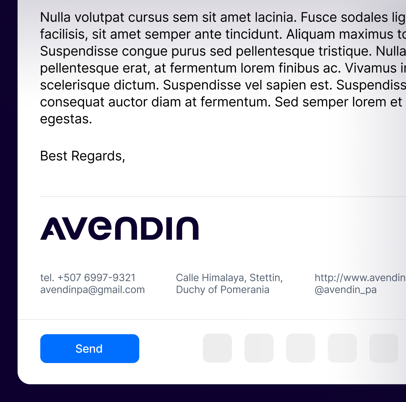
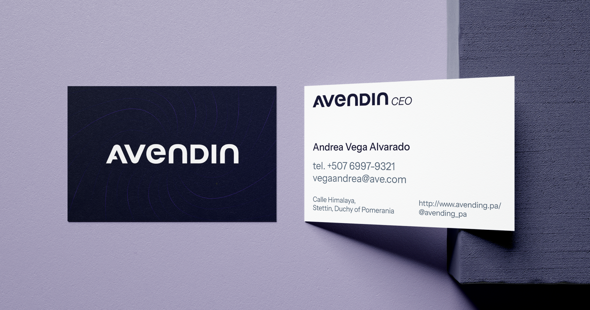
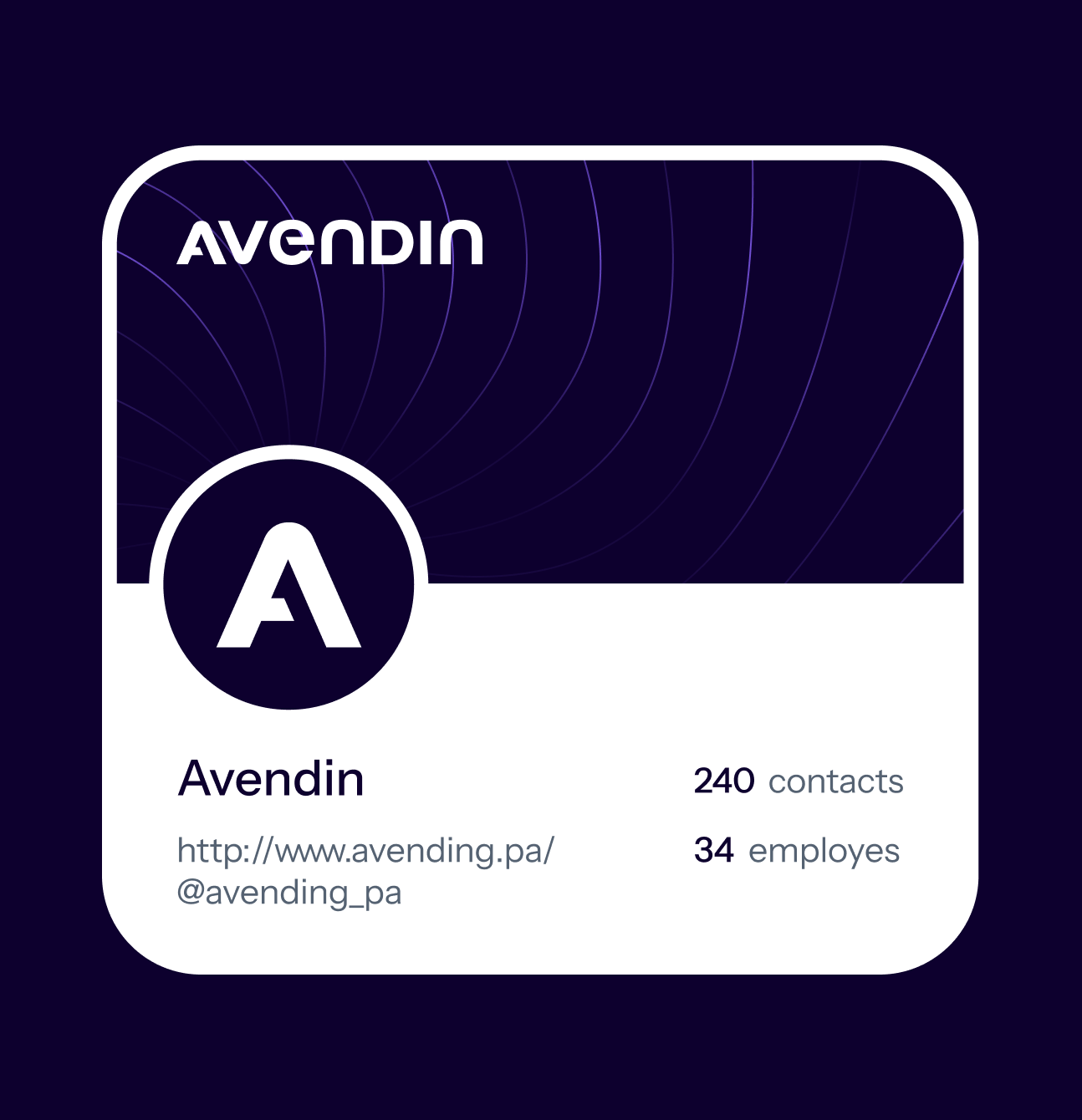
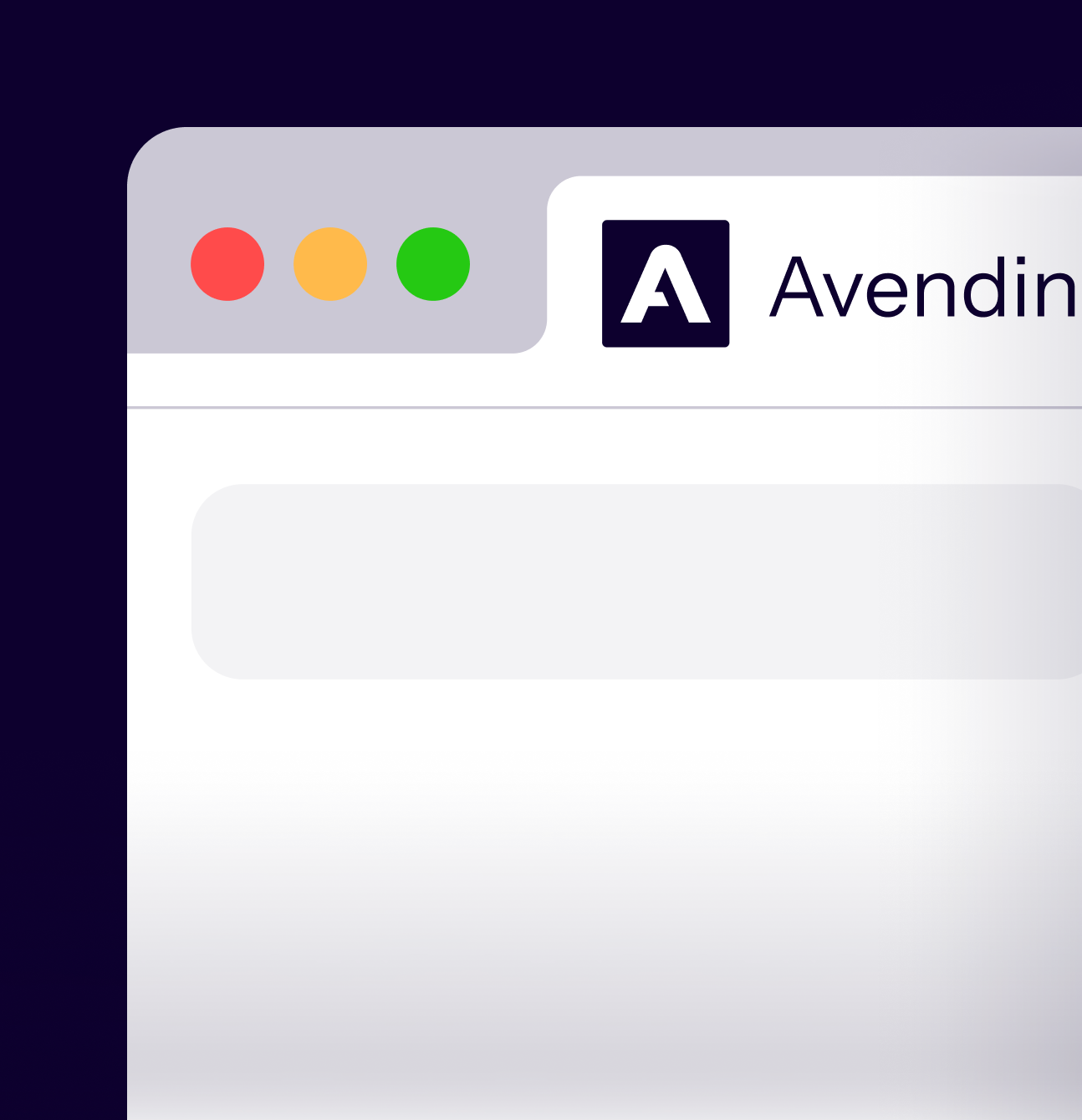
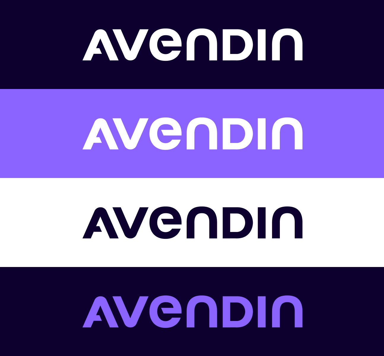
The final visual identity is confident and modern. It uses a purple-based color palette for a sophisticated look, and the versatile "A" works perfectly as a standalone icon across all digital platforms.